Thursday, May 29, 2014

Cover A5t Update

So this weekend I was at Comicpalooza. So was David Petersen and I was lucky enough to see him give an artist a very in-depth and detailed review of her portfolio. Among the things he mentioned was the dangers of making an image bigger. If you've ever taken a computer graphic that looked great on the screen and tried to blow it up to be a massive poster on your wall, you know the troubles he was speaking of: sharp lines become blurred (or even pixelated), details grow fuzzy, definition is destroyed.

I'm wondering how much of this we're seeing in the 5e covers? Apparently, this is the full picture Tyler Jacobson created for the PHB:


I gotta admit, as an image, I like this (even if it does look like the giant's been cut off at the knees). It's got action and scenery and reveals a lot of imagination. I love the hellhounds chained beside the throne and the dragon wing hanging from the giant's fancy hat.

I still don't like the crop they made for the cover, though. And blowing up the image like that didn't do anyone any favors.

Someone (Stuart Robertson? I can't find who now.) commented about the bad crop jobs done on these covers, how they're too close, cutting out interesting details and reducing important figures to illogical bits. Seeing the full version of the PHB, I can only agree.

I'm still not a fan of the art for the DMG. It's neat, but really doesn't knock my socks off. Apparently, the liche is raising the recently deceased to join it's legions of undead. Neat idea, but I think I'm just not on the same page as the artist when it comes to motivating DMs:

The lich is extremely powerful and we wanted the DMs out there to get excited about wielding that power. From my angle, I wanted the lich to be looming over the viewer and seem unstoppable as he raised the corpses around him. Heroes that just fell in an attempt to destroy him are now working for him. Very demoralizing.

Tuesday, May 27, 2014

The First Hit is 5ree!

Today we learn that Basic D&D will be a free PDF. We'll get the basic four classes (fighter, wizard, rogue, and cleric) up to level 20 and the basic four races (human, elf, dwarf, and halfling). The analogy drawn is between Rules Cyclopedia and AD&D. I'm not entirely sure how well that analogy holds up (TSR made a big deal back-in-the-day about D&D and AD&D being completely different games), but it does make it fairly clear where their thinking is.

This isn't, of course, exactly unheard of. LotFP has had their rules available for free for years now. So are the rules for Pathfinder, via the SRD. Skirmisher's Bookforge project is largely tentpoled by free rules.

I suspect Basic D&D will be different in that it'll be a much prettier thing. It will include art and layout and such optimized for an electronic document. If WotC is serious about this thing, it should also include a basic character generator that will walk you through the process and give you a character sheet you can print out at the end of it. It should also come with a basic dice-roller for folks who've downloaded the game but don't have a local store to get dice TODAY! I doubt they're that serious about it, alas, and we'll just end up with a basic PDF that might include bookmarks and have lots of pretty art in it.

Of more interest to me is how this turns the conventional wisdom, well, not quite on its head. WotC is still planning to sell big, expensive coffee-table books (though those who claim they'll never play the game due to the expense have just had the rug pulled out from under them in an amusing way by Wot€) and I suspect the sale of those books is considered the backbone of their income strategy. The loss-leader is now a bit more out-and-up-front for them. After all, while many RPG publishers do offer free PDFs of their rules, they don't treat those PDFs as “product” in their own right. This is WotC making a big production of the loss-leader, which, honestly, is how you're supposed to do it. If it doesn't come with a lot of how-to advice and a holding-the-first-time-DM's-hand starter adventure, I'll be disappointed.

Not surprised, mind you, just disappointed. After all, an RPG loss-leader should leave everyone hungry for more, and the best way to do that is to get them to roll up characters and play them. A solo-adventure followed by a beginner-DM-friendly adventure that's also really cool would seem the obvious ways to go.

What also would be cool? A collection of head-shots to use as character portraits, sure, (and WotC certainly has access to a large collection of that sort of thing) but what would make people getting this PDF really want to play it RIGHT NOW? What could they do to make sure that first experience was so cool that nobody can wait to do it again? I think the focus should be on that first adventure, and it should include printable maps and fold-over minis, art the DM can pull up on a screen to show the players during the adventure (like the cut-out pictures from Tomb of Horrors), and LOTS of good advice about how to run and build fun adventures.

But that's just me off the top of my head. Coming up with ideas like this isn't my 9-to-5, nor do I have access to WotC's playtester feedback and marketing research. They ought to be brainstorming on this question like mad. Or, rather, they should have been doing that when they started the Basic D&D project. So far, they haven't said anything that leads me to believe that this will be a stand-out, knock-our-socks-off product. But then, we're only just now hearing about it, so who knows what else they may have up their sleeves?

Saturday, May 24, 2014

Parlez-vous Melnibonéan?

From France, the land of epic comic books, comes this:

Thursday, May 22, 2014

Industry! (Hunh!) What is it Good For? (Part the Second)

Among other things, giving us (the consumers) the benefits of bulk discounts:

Wednesday, May 21, 2014

Approaching the Last Two Days for the Simple System Kickstarter

The Simple System is in its last 50 hours of Kickstarting as I write this.  This is the RPG with the card-based resolution system I blogged about last week.  Mr. Matthews is also looking for feedback on design changes he's experimenting with to make the cards easier to read for those who are colorblind.  I know a number of my readers know a think or two about graphical design; please stop by and give him your two cents.

Thanks!

Monday, May 19, 2014

Cover A5t

Oh.

Um.

Oh dear?

Ok, it's not that bad. But it does like rather generic. I mean, these look like, hey, look, another fantasy RPG. Nothing exciting here.

Granted, part of that is how front-and-center the art is, with the titles very minimized. They're almost not there. I want to click or swipe to make them woosh off the screen. That's not a bad thing.

It would be a better thing if the art was knock-my-socks off.

Anyone have any idea who made these? I'm about to horribly insult them, whoever they are.

First off, the good: they all clearly belong to the same product line. No confusion there. I'm not entirely certain they are all the work of the same person (the lighting and textures for the MM and DMG are very different, and there's a subtly muted, almost simplified feel to the colors and textures of the starter set). If that's the case, the art direction is all the more impressive for it.

The cover for Hoard of the Dragon Queen is fun: shiny dragon, cool (ha-ha) attack, neat use of color to highlight the action. My favorite of the bunch.

But I'm seeing nothing here I'd want to put on my wall, and absolutely nothing that makes these leap off the shelves.

The MM has the most painterly look to it. It reminds me a bit of WAR's work, but with much less character. In fact, it almost looks like it was fashioned from cut-and-pasted elements. Haven't we seen that exact pose of a beholder before? Is that a dwarf from an interior 4e illustration? What's up with the screaming, turbaned person of indeterminate gender? Are they in the same picture? Do they know there's a beholder behind them? And why is that statue spitting lightning bolts? Or is it getting hit in the face with lightining bolts? And why is there a staircase to nowhere in the background? Seriously, it's a jumble of elements which aren't really interacting with each other.

The rest have this odd, overly sharp 3d feel to them, as if they started as poser art and then were hit with oil-painting filters in Photoshop. The teeth of the green dragon, the hands of the giant, all have this oddly sharp feel to them even though, as you look closely, you can see the brush strokes and other artifacts of painted work. It's very odd.

And the DMG, I'm sorry to say, has the look of poser art from a distance: the electric glow that washes out all other colors, the plastic-looking skin, the shadows. A second, closer look reveals the painterly techniques, but...

And what, exactly, is going on in this picture? Is he animating a corpse? Killing a dude? And is it just me, or does the liche's amulet (clearly a shout-out to the Green Devil-face) look like it was added in later?

One thing that does jump out is the central place of the monsters. The heroes barely fit in the frame, clearly playing second-fiddle to the monsters, each of which commands center stage. I'm curious to see how far we've moved away from the character-centered art of late 3.x and nearly all of 4.x. In none of these pics do I recognize a hero who's doing something really cool. Maybe the Viking sorceress on the cover the PHB, but it's hard to make out any details on her. Dress her in something other than her furs and I'm not sure I'd recognize her. Ditto for the elven-warrior-of-indeterminate-gender who's with her  All-in-all, the giant on the PHB, with his awesome white-dragon-pelt hat is the coolest character in the bunch.

(So is the difficulty of assigning gender to the figures part of WotC's way of foiling the folks who count and comment on that sort of thing? Or an artifact of conscious effort to make the heroes cyphers upon which the viewer can project their preferences, rather like the art in the old Choose Your Own Adventure Books?)

The covers for 3e were daring, unique, and put you in the world of D&D; you, the player, were holding artifact tomes from magical realms of lore and adventure. The 4e covers were clearly attempting to ride the zeitgeist with their comic-esque, uber-cool figures.

These 5e covers do not look like the flagship products of an industry or a hobby. These look plain, almost timid. They look like the work of, well, hobbyists throwing things together in their spare time, with only a modicum of design knowledge gleaned from Google-found top-five lists. Seriously, how are these very meh covers supposed to share shelf space with the likes of these:


 It's official: so far as production values go, WotC is getting their behind handed to them by a guy in Finland working out of his living room (NSFW!).

Addendum: I haven't been as clear as I should be when I describe the art as "generic."  What I mean is, this doesn't look special or noteworthy or of greater renown or quality.  That's what I mean by "generic" here.  Not so much that this is a game based on standard tropes of fantasy gaming, but rather that these are nothing to get excited about. These do not look like the flagship products of fantasy RPGing. They look like just more in a sea of interchangeable products. Nothing here says, "This is D-and-motherfucking-D, the 500 lbs gorilla of RPGs, the game that started it all, the standard by which all others should be judged." Walking into my local gaming stores with no real knowledge of the hobby, I'd be just as likely to pick up Dragon Age or DCCC as these, just based on the covers, and far more likely to grab Pathfinder, ACKS, or RuneQuest (all of which I can find at local gaming shops in town).

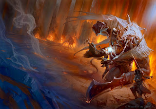
Addendum the Second:  via Walser's Raging Owlbear, a mock up by Stuart Robertson that is, if nothing else, a lot more fun than the ones WotC chose to go with.  I'm not entirely sure I prefer the heavier trade dress he uses to the minimalist choices of WotC, but I can see why folks both prefer and expect that sort of thing.  And, as Robertson points out, WotC already has access to (and has been using to promote 5e) art that is more fun and more powerful than the choices they decided to go with.
Thursday, May 15, 2014

In Which Trollsmyth Blegs for More!

While I'm busy dusting the shelves and knocking away the cobwebs here in my online home, I can't help but see that the blog roll needs some serious work.  A lot of those links don't actually go anywhere anymore, and some blogs haven't been updated in years.  So, time to fix that.

If you know of any blogs that really belong there, please drop me a note either via email or in a comment below.

Thanks!

Tuesday, May 13, 2014

Simple System: Heartbreaker for a New Generation

There’s a lot of stuff I like about Derek Matthews’ Simple System tabletop RPG. Mr. Matthews has clearly been hanging around “the community” (or, at the very least, Big Purple) and reading lots of game design theory. The result is a game that plays with some nice mechanical differences at the table.

The most obvious difference is using cards instead of dice. I’ve read quite a bit about how well using plain old playing cards works for initiative, since you can see right on the card who is next, which is why Savage Worlds uses them. Playing cards are also very easy to read, even from across the table.

Mr. Matthews takes this a step further by creating custom cards that include a lot more information than you can gather from suit and number. By making his cards square and putting a different “number” along each edge, he’s allowed a single card to provide results for four different difficulty levels. A second, more inner ring of “pips” offers additional numbers (primarily used for weapon damage and armour damage-blocking). The center of the card is dominated by a teardrop direction indicator surrounding a larger number whose primary purpose is initiative. In short, each card is packed with data that can be used in a number of ways and can be read fairly easily from across the table due to the bright colors chosen (though I’m a bit surprised about the repetition of colors; green and red are used both for results and as background colors which, I would think, would make reading the cards slightly more difficulty than necessary).

Another clever piece of design I’ve read about, but can’t remember actually seeing in practice before, is rewarding players directly for invoking flaws at the moment the flaws come up in play. When creating a character in the Simple System, you can have one skill for each flaw you give your character. When your flaw is invoked in the game, you get a hero card which can be used for “rerolls”, one-use buffs, as extra hit points, or turned in at the end of the adventure as experience points for leveling-up purposes. So instead of having to weigh and value such flaws in a vacuum, players can be encouraged to come up with whatever flaws they like; they only get rewarded for those character flaws that actually come up in the game.

(So far, the only mechanism Mr. Matthews has mentioned for acquiring hero cards is the invocation of flaws and the awarding of three cards at the beginning of each adventure. I imagine there will also be ways to earn hero cards by successfully completing adventures. If the invocation of flaws is the principal method for earning most of your hero cards, then Simple System games are largely about characters getting into trouble. That sounds, to me, like a recipe for very fun games.)

Beyond these innovations, Simple System looks like pretty much every generic RPG you’ve played before: six stats that map nearly perfectly onto D&D’s original six, more complex and detailed rules for combat, and a strong focus on gear (though as the rules stand now, it does appear that stats are the most important thing on your character sheet, with skills and equipment offering bonuses or dictating results). The game also encourages the use of miniatures and maps. While that encouragement isn’t maybe as strong as 3.x D&D’s, you can absolutely see how Simple System is going to feel very familiar to players of Type III D&D.

In fact, it’s easy to see Simple System as a reaction to 3.x’s failings. The focus on simplicity, the “~30 page rulebook,” being able to create a character in “5 minutes or less,” having everything you need to know about your character’s gear and powers printed on cards right there in your hands, and the eschewing of diagonal movement, all look like reactions against 3.x’s greatest sins. There’ll be no flipping through 200 page tomes looking for the exact wording of a rule or spending hours crafting your character’s development path.

It does appear to be similar to Type III D&D in that it assumes a lot of prep-work ahead of time, mostly in the form of preparing handouts (in this case equipment and antagonist cards in addition to gridded maps for the miniatures). There’s no reason you couldn’t play with all that stuff, of course, but the default is clearly prepared adventures with a focus on combat encounters.

That said, Simple System is, well, simple. And RPGs with simple rules just beg for houseruling. With today’s ubiquitous printing and production facilities, I suspect house-ruling and house-printing cards will be a common thing.


I’ve yet to get my hands on this one, but from what I’ve seen, I like it. If I were to run an RPG set in the 40k universe, Simple System’s miniature rules would be a nice nod towards the wargame elements without turning the session into a wargame. The card-flipping mechanic looks nice and quick, the math is negligible, and with all the rules for powers and gear printed on cards players have at the table in front of them, I suspect Simple System games will move at brisk clip, especially compared to more rules-heavy systems like WotC-era D&D or even Savage Worlds. It might even give Fate a run for its money in the speed department. Tailoring the cards for your particular campaign might even give a new shot in the arm to really bizarre settings, making the aesthetic elements more present at the table. I certainly hope we see more of the Simple System, and I hope it inspires others to stretch even further outside the box.

Friday, May 09, 2014

Schrödinger's Personality

I ran across this list of 11 ways to be a better roleplayer. I think the list gets weaker the further along you go, as it delves deeper and deeper into “don’t be a dick” territory (important, yes, but not nearly as useful to those of us who, as a general rule, don’t play with people lacking in basic manners). However, the beginning of the list, and most especially the first two points, are solid gold.

I especially like point the second, Realise that your character does not exist outside of the things you have said:

You can write as many pages of backstory as you like, mate, but they don’t factor in one bit to the game unless you show them happening. Are you a shrewd businessman? Cool. Do some business, shrewdly, in front of everyone else. Are you a hot jazz saxophonist? Play the saxophone. Are you a wild elf struggling through social interactions with civilised people? Struggle through those interactions! Don’t go off and sit in a tree, you prick!


And this ties directly into what you can actually pull off at the table. No, I’m not talking about allowing only people with exceptional social skills to play high charisma characters. The issue is more fundamental than that.

To whit, it’s rather frustrating, as a DM who’s built adventures around a character background full of derring-do and wild escapades, to discover that said character is actually played with all the caution and timidity of a mysophobic in a kindergarten classroom.

Granted, sometimes life, and the game, conspire against you. You meant to play a more colorful character, but traveling with the happy-go-lucky pixie rogue has you playing the straight man. Sometimes that’s just the best way to do things, and you have more fun playing with the other players than your original, conceived-in-a-vacuum idea would have been. No worries there; just adjust and roll with it.

Even better, however, is when you and your fellow players can actually build these interacting personalities together. This is one of the reasons many old schoolers prefer to begin with minimal background; what’s needed can be invented on the fly that way, after you’ve had a chance to see the character in action, interacting with the rest of the party and the campaign world.

And that leads me to imagine a group character generation system in which stats and skills are created via interacting tropes that are developed through the first adventure of play. That is, you begin with the bare-bones skeleton of a character (perhaps even one suffering from amnesia) and, as you create relationships for your PC with the other PCs, you flesh out skills, bonuses, and quirks accordingly. I’ll bet you could come up with dozens of templates just by browsing through tvtropes.org.